PROBLEM STATEMENT
How might we revamp the Kroger app to address user challenges, streamline navigation, and maximize user recognition?
Success Metrics:
Achieve an increase in task completion rates, user satisfaction, and feature adoption while reducing support requests for the Kroger app.
PROCESS
Started with Stakeholder Interviews
Concluded with actionable recommendations based on user research

TARGET AUDIENCE
We gathered input from a range of users via testing and a comprehensive survey to evaluate the app's appeal and ease of use across diverse backgrounds.

TASKS FOR THINK-ALOUD
Task 1: Onboarding Process
-
Ask the participant to download and install the Kroger app if they haven't already.
-
Instruct them to go through the onboarding process as they normally would.
-
Specifically, ask if anything is confusing or unclear.
-
Inquire if any steps seem unnecessary or could be completed more efficiently.
Task 2: My List Feature
-
Ask the participant to find the "My List" feature on the Kroger app's home screen.
-
Encourage them to describe where they think it might be located.
-
Once found, instruct them to create a new list and add three items.
-
Encourage them to share their experience and any challenges encountered.
-
Prompt them to consider how they would handle adding a forgotten item later.
Task Sucess Criteria

THINK ALOUD RESULTS
During the think-aloud sessions, we collected quantitative data. This process provided us with insights into how users are interacting and what their experience with the application was like.

Insights
-
Most users (6/12) completed the onboarding task without assistance.
-
6 users needed assistance, while 4 completed the My List task independently out of twelve.
-
Users encountered minor issues with onboarding, while one-third reported major issues with the My List task.
-
My List task had a max error of 5, surpassing the onboarding task.
-
Average time taken:
Onboarding - 166.92 sec
My List task - 249.67 sec
SYSTEM USABILITY SCALE SCORE
It is a quick and reliable tool for measuring usability. It includes a 10-item questionnaire with five response options, ranging from Strongly Agree to Strongly Disagree.
System Usability Scale Form:

In evaluating the Krogers application's usability through the System Usability Scale (SUS), key scores and calculations were derived for the assessed tasks:
-
Mean SUS Score: 64.17
-
T-Score: -2.85
To determine if the perceived usability is high (SUS score > 80), a hypothesis test was conducted. With a t-score of -2.85 (less than the critical value of -1.36), there is enough evidence to reject the null hypothesis that the perceived usability is not high (SUS score <= 80).
AFFINITY MAPPING
To understand why this usability is not high, all the insights received were gathered by conducting interviews, think-aloud sessions, and surveys. Affinity mapping was then performed, identifying codes from it to better understand user pain points.
Codes
Uncommon fields, Confusions, Unnecessary data, Finding feature, Update list items, Feedback, User expectation vs App functionality, Usefulness of ‘My List’ feature, Icons, Navigation, Text, Kroger’s Pluses

USER PERSONA
After completing an affinity mapping exercise, synthesize key insights from user research into detailed, realistic representations of your target user's created user personas. This deeper understanding of user goals, pain points, and behaviors helped inform design decisions, align the team around user priorities, and validate assumptions - ultimately leading to more user-centric recommendations.


USER RESEARCH FINDINGS
INSIGHT
VISUAL
Participants encountered confusing text fields during onboarding

Users were not familiar with some of the words and icons used in the app

Users had difficulty locating and understanding the "My List" feature

Users faced difficulties when attempting to remove items from their lists

User wants to enter the address when checking out from the cart, not when onboarding the Kroger app.

KEY RECOMMENDATION
From the brainstorming sessions among the teams came up with certain recommendations to address the research findings
Streamlining Onboarding Process: Defer address input and Kroger's pay setup to later stages, such as during checkout, reducing unnecessary information during onboarding.
Post-Onboarding Tutorial: Implement a tutorial after onboarding, utilizing screen opacity to highlight application features and guide users on how to use them effectively.
Enhance My List Visibility: Integrate the My List feature prominently in the bottom navigation bar on the home screen or as a bubble button at the bottom right, ensuring easy access for users.


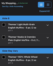
Active List Indication: Add a tag to the current active list in the My List feature, providing users with a clear indication of where items will be added.
User-Controlled Product Placement: Empower users by allowing them to choose the destination list when adding a product to My List, offering a more personalized experience.
Refine My List Concept: Align the My List feature with common user perceptions of favorites or present it in a way that communicates its concept to users, ensuring a more intuitive experience.
